Saturday, March 14, 2020

3D Reflection 35 - Making Alphas

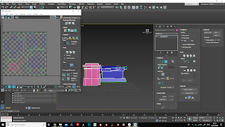
I made a sheet of alphas for the decorative window trim, palm tree leaves and Ivy that would hang from the walls and climb the bricks.

I decided to make leaf alphas instead of use 3D modelled palm leaves as I could apply more detail to the shape, and they would be much lower poly than the 3D modelled leaves.


At first the edges were not cropped close enough to the alpha object in my alpha channel in photoshop, and I had also forgotten to apply a background fill colour. As a result, the leaves and red tassels of the window trim had a gold outline. To fix this, I went back into photoshop and cropped the shapes more closely. I also painted a fill colour onto the background.


The result was a much cleaner alpha with no outline. I used my old 3D modelled leaves as reference for size and arrangement for the new alphas.


I applied some extra loops to the larger leaves that needed more curve.


I applied the trim to the rest of the window decorative trim. I deleted the stand in 3D object that was there previously and replaced it with the new alpha.


For both the long and short ivy alphas, I added a loop in the centre and pulled it back to get a more realistic shape.


I am glad that I decided to use alphas as the final outcome looks much better and more detailed, which fits the realistic style of my team project.

3D Reflection 34 - making tree leaves and papyrus in 3D

I decided to try making the papyrus plants and palm tree leaves in 3D instead of using alphas at first, as I thought I could achieve a convincing realistic result.


I like how the papyrus plants turned out, as I was able to use copied UVs and also change the shape of the stem by preserving the UVs. I was therefore able to make variations of both standing and bent papyrus stems. I will also be able to practise lodding with this in UE4.


I was not fully convinced with the palm tree leaves however. I felt that they were far too high poly and did not achieve a good level of detail. I decided that instead, I would use an alpha to make the leaves as I could make them lower poly but higher detail in terms of shape.


3D Reflection 33 - Implementing character mesh, materials and rig in engine

I started by checking that my materials were assigned correctly and checking that the rig was well weighted before exporting all from 3Ds Max.


At first when I plugged in my materials I had issues with metalness an roughness values appearing inverted. With help from my tutor I identified the issue, which was that I needed to untick an option in the material settings.


I also had issues with the Subsurface Scattering mask. I was able to apply it to the entire body but not individual areas, despite masking it out. I decided that without the additional Subsurface  mask, the character still looked realistic, and there was minor subsurface that had been exported with the material maps anyway.


I encountered another issue, regarding the size of my texture maps. I found that I had surpassed the 18 MB limit, and so I needed to reduce the size of one of my maps. I decided to reduce the size of the accessory normal map, as the details would not be as prominent and large in engine, so it would not make much difference visibly, and it put me comfortably within the 18 MB limit at 16.5 MB.


The results were still effective.


I found that the details were still of high quality and I was happy with the realistic appearance of my character.


The next stage was to implement and reassign the bones to match the UE4 rig.  I found this a challenging process as I found it easy to make mistakes with the bones I was matching up.


At first the test animations showed what I thought was incorrect rigging on my behalf from my max file. The wrists and feet were deformed. However, after changing a setting I saw an instant change as the skeleton matched up with the UE4 rig.


I went back into the bone managing window and removed the bones from the fingers as I decided that the Pharaoh did not need to have moving fingers for his role in the game. 


The test animations showed that my rig was successful.


3D Reflection 32 - Lightmapping assets and cloth simulation

I packed my objects together into groups that would fit onto a UV sheet well, e.g. vases , tables and cushions together, and walls that needed tile textures separate. I then tested my lightmaps by putting my objects into engine. I was pleased to see that the lightmaps were well done as there was no overlapping or seams. 


Packing and assigning materials ready for export and texturing


Testing in engine 


I also experimented with cloth simulation, as I was not satisfied with the current cloth that I had produced and wanted to make something more realistic. I experimented with cloth weights and direction, choosing to go with a silk cloth weight that is hanging from two tension points at the top and secured at the bottom. This would be attached to the wall in the garden section of my level, on either side of each door.

First test


Next test with more tension points


Final cloth


I was much happier with this version of the cloth as it was more realistic in shape and folds.


Traditional Blog Topic 8 - Formative improvements

I took notes of the improvements that my tutor and classmates said I could do for my work and implemented the improvements. The overall results showed how I could push my work to an even better standard.

The first piece that I improved was the skull with drapes. I ensured that I added more contrast to shadowed areas of the skull, such as the back and underneath, as well as the hollow areas. I also lightened the flower petals to make them stand out more, and to fit the tone of the real flowers that were far lighter in value.

Skull with Drapes


The next pieces that I improved were the line weight drawings of figures. I started by getting rid of the preliminary drawing that was unfinished, as it did not need to be there and took away from the rest of the figures on the page. I applied more shade to the large final figure, such as under the thigh where there was a lot more shadowing, and I also applied more shadows to indicate the muscle shapes, particularly in the upper back.

Line figure drawing


For the torso and leg drawings, I varied the lighting a lot more which resulted in a more interesting and dramatic drawing, as previously the light was the same all over for a lot of the torso and leg drawings. I added lighter values by erasing areas that needed to be hit by light.


Leg Sketches


Torso Studies


For the charcoal portrait, I reduced the bounce light under the chin as it was too prominent and altered the shape of the face too much. Once I did this I could see a much better impression of the true shape of the face.

Charcoal Drawing


The cool pastel portrait was improved by adding lighter tones to the face, such as light pinks and white. This immediately made the drawing a lot more effective and three dimensional rather than just flat with he same contrast all over. I used a neutral black for the clothing.

Cool pastel portrait


The warm  toned pastel portrait needed more contrast around the eyes and ears. For this I used a black and brown pastel to darken these areas. I also used black for the clothes in this piece.

Warm pastel portrait


For the warm and cool pencil portrait, I adjusted the highlights and added a stronger impression of directional lighting. I added highlights in the glasses frames and reduced the brightness of the whites of the eyes.

Warm and Cool Portrait