Final concept - first version
After receiving feedback from my tutors, I added warmer tones of light to contrast against the cool tones and to enhance the metal parts of the outfit. For example, the shotgun shells in the bandolier did not stand out enough and so adding a contrasting warm tone made them pop out a lot more. I also changed the orange background as it was too distracting and took away from the design.
Final concept - second version
Overall, I am very pleased with my final character design. I will use her as reference for the saloon interior.
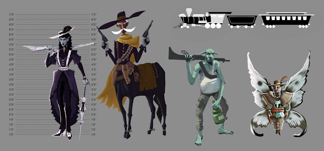
In class I put my character design amongst my teammates' to see if the styles align. The styles all matched quite well, and together we went over elements we could improve to make them match further. One major point was the use of bright highlights, which would work well on the sharp edges of the character. One thing we captured very well was the shape language - the use of angular sharp edges and different height and thicknesses.
Comparing the styles of my teammates' characters


No comments:
Post a Comment