After receiving a lot of feedback on how to improve my presentation and the work I have done, I went back to implement these changes. I also continued developing whilst keeping the feedback in mind in order to produce something a lot better.
I edited my moodboard and got rid of images that weren't helpful, as well as using iconography to neatly highlight my images.
Next I neatened my thumbnail sketches and drew attention to the one I chose to develop.
Column iteration
Detailed colour and pattern variations
Instead of just using sketches to portray foliage, which was time consuming, I tried a photobash in a later page. I found that this was more efficient and better showed how the final product would look.
Adding material swatches was also much more efficient.
I ensured that my sketches were arranged clearly, and pulled in reference where neccessary.
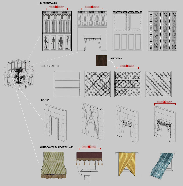
As I said previously, part of my feedback was to pay better attention to detail in my page about trims. Therefore I used a combination of photobashing and sketching to improve the level of detail and accurately convey material qualities.
I found that deconstructing my walls in this way was an efficient method of exploration.
I did a page of damages that were inflicted on the area. I was told to include them into the final sketch, so I ensured that I added callouts for them in the final.
This is the final area. I used my 3D work as a base for a paintover, and applied a lot more detail using my exploration work. I also added in detail callouts to make parts clear to a 3D artist. For the presentation, I used artbooks for inspiration, particularly Assassin's Creed as we were tailoring our project to fit Ubisoft's style.


No comments:
Post a Comment